
Blog

Mastering Branding Excellence: How Consistent Brand Identity Fuels Success
Introduction: The Critical Role of Brand Consistency
In today’s fast-paced business environment, particularly in dynamic regions like Sacramento and the Bay Area, the importance of a consistent brand identity cannot be overstated.
For companies striving to stand out in these vibrant markets, branding is not just a matter of logo design or catchy slogans; it’s about crafting a cohesive story that resonates with your audience and remains consistent across all touchpoints.
Whether you’re a budding startup in the tech-savvy Bay Area or an established enterprise in the diverse Sacramento region, understanding the high stakes of branding is crucial.
In this interconnected age, a well-executed brand strategy can mean the difference between thriving and just surviving.
As we delve deeper into the nuances of effective branding, remember that a strategic partner like Stan Consulting, with its deep understanding of the local business landscape, can be an invaluable asset in navigating these challenges.
By focusing on a tailored approach that respects the unique needs of businesses in our service radius encompassing Sacramento and the Bay Area, we aim to illuminate the path to branding success.
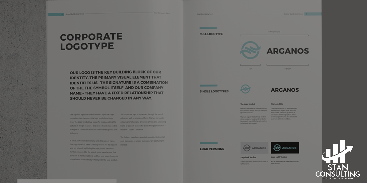
The Brand Book: Your Blueprint for Branding Success
A brand book, often referred to as a brand guide or brand manual, is essentially the DNA of your company’s branding strategy.
It serves as a comprehensive guide that details the dos and don’ts of your brand identity, ensuring consistency and cohesiveness in every aspect of your business’s public-facing persona.
For businesses in Sacramento and the Bay Area, where the market is teeming with innovation and competition, a well-crafted brand book is not just a nice-to-have; it’s a fundamental tool for ensuring that your brand stands out and communicates effectively with your target audience.
Why does every Sacramento business need a brand book?
The answer lies in the power of consistent branding. In a diverse market like Sacramento, with its unique blend of cultural and economic influences, a brand book helps maintain a consistent brand voice and visual identity.
This consistency is crucial for building trust and recognition among your target audience, whether they’re residents or part of the broader Bay Area’s tech-savvy, forward-thinking community.
The key elements of an effective brand book include:
- Brand Story and Values: This section outlines your company’s mission, vision, and the core values that drive your business. It’s about defining what sets your brand apart in the Sacramento and Bay Area markets.
- Logo Usage: Specific guidelines on how to use the logo, including size, spacing, and acceptable variations. This ensures your logo looks its best in every application.
- Color Palette: A detailed look at your brand’s color scheme, with exact color codes for print and digital use. Consistent use of colors reinforces brand recognition. (Free Resources to use: Coolors, Canva, Adobe)
- Typography: Guidance on the fonts your brand uses, including how and where they should be applied. Consistency in typography aids in maintaining a cohesive brand look.
- Imagery and Photography Style: Directions for the types of images that should be associated with your brand, ensuring that all visual elements align with your brand’s tone and message.
- Voice and Tone: A description of your brand’s voice and tone, ensuring that all written communication is uniform and aligns with your brand personality.
- Application Examples: Practical examples of how your brand elements should be used in various contexts, such as marketing materials, digital platforms, and advertising.
In the hands of a business in Sacramento or the Bay Area, a brand book becomes more than a set of guidelines; it’s a strategic asset that shapes how your brand is perceived and experienced.
At Stan Consulting, we understand the nuances of the local market and can help craft a brand book that not only preserves the essence of your brand but also resonates with your audience in this unique geographic region.
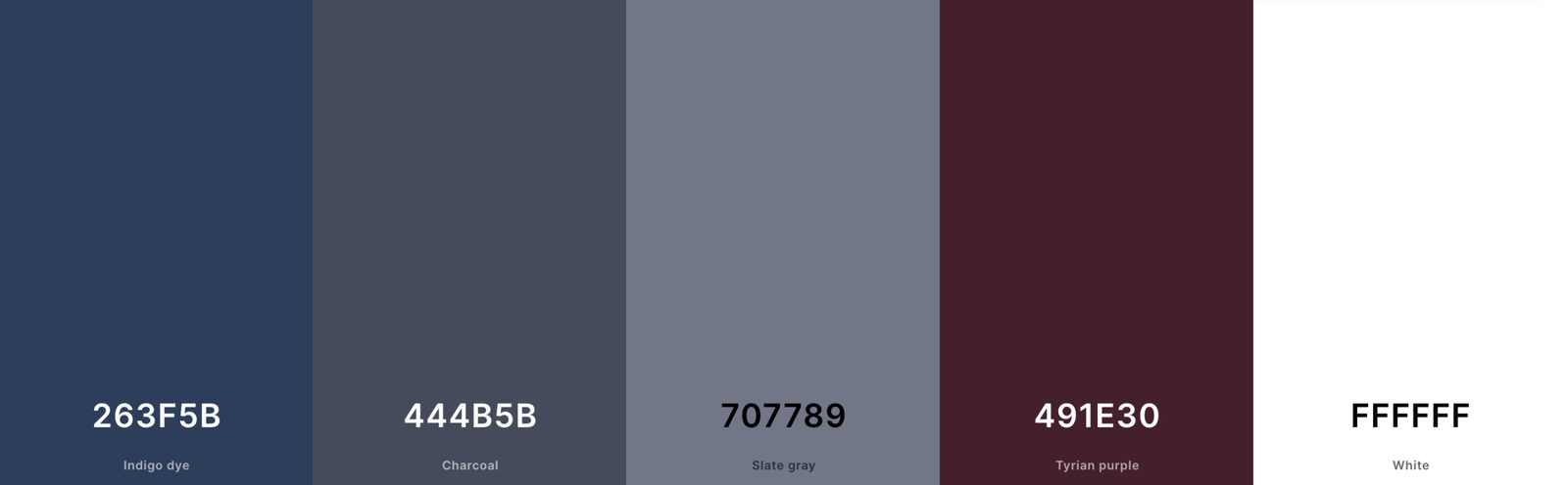
Color Psychology in Branding: Choosing the Right Palette
Color is a silent yet powerful language in branding. The right color palette can evoke emotions, convey messages, and significantly impact customer perception.
The psychology behind color choices in branding is complex, yet understanding it is crucial for any business looking to establish a strong and memorable brand identity.
When selecting colors for your brand, consider the emotions and associations each color typically invokes. For instance, blue often represents trust and reliability, making it a popular choice for financial institutions and healthcare companies.
Green, symbolizing growth and health, is frequently used by organic and environmental brands.
Reds can evoke excitement and urgency, which is why they’re common in the food and entertainment industries.
However, the key to effective use of color in branding isn’t just about choosing the right hues; it’s about consistency.
Consistent use of your chosen color palette across all your branding materials – from your logo and website to your product packaging and marketing campaigns – helps in building brand recognition.
Over time, these colors become synonymous with your brand, making it instantly recognizable to your audience.
Here are a few tips for choosing and using a color palette in your branding:
- Understand Your Brand Personality: Choose colors that reflect your brand’s character and values. If your brand is bold and energetic, vibrant colors might be more suitable than muted tones.
- Consider Your Target Audience: Different demographics may have varying responses to colors. Research your target audience’s preferences and cultural associations with colors.
- Limit Your Palette: Too many colors can create confusion and dilute your brand identity. Stick to a primary color and one or two secondary colors for consistency.
- Test Across Different Mediums: Ensure your chosen colors look good both online and offline. Some colors may appear differently on screens compared to printed materials.
- Stay Updated with Trends: While consistency is key, being aware of color trends can help keep your brand relevant. This doesn’t mean changing your colors frequently, but occasionally refreshing your palette can keep your brand modern and engaging.
Remember, color is more than just an aesthetic choice; it’s a strategic tool in your branding arsenal. By choosing and using colors thoughtfully, you can create a stronger and more cohesive brand identity that resonates with your audience and stands the test of time.

Design Consistency: The Visual Language of Your Brand
Design consistency is the cornerstone of brand recognition and customer perception. It’s about creating a cohesive visual narrative that communicates your brand’s values and identity at every touchpoint.
Whether it’s your website, product packaging, or advertising, consistent design elements make your brand instantly recognizable and help to build trust and familiarity with your audience.
How does consistent design impact customer perception? When your brand’s visual elements are harmoniously aligned, it conveys a sense of reliability and professionalism.
Customers are more likely to trust a brand that presents itself consistently across various platforms. This consistency also aids in brand recall, making it easier for customers to remember and choose your brand over competitors.
Here are some guidelines for maintaining design consistency across all platforms:
- Establish Clear Brand Guidelines: Develop comprehensive brand guidelines that detail your design elements, including color schemes, typography, imagery, and logo usage. This document should serve as the go-to reference for anyone creating content for your brand.
- Consistent Logo Usage: Your logo is a critical element of your brand identity. Ensure it’s used consistently in terms of size, color, and placement across all marketing materials and platforms.
- Unified Color Scheme and Typography: Stick to your brand’s color palette and typography styles in all your designs. Consistent use of these elements reinforces your brand identity and aids in visual recognition.
- Maintain a Consistent Style in Imagery: Whether you use photographs, illustrations, or graphics, ensure they have a consistent style that aligns with your brand’s character. This consistency should be evident in your website, social media, and any visual content you produce.
- Cohesive Layouts and Templates: Use similar layouts and templates for your marketing materials, whether it’s for digital or print. This includes business cards, brochures, email newsletters, and social media posts.
- Adapt While Maintaining Core Elements: While it’s important to adapt your designs for different platforms (e.g., social media, print, web), the core elements of your brand should always be recognizable.
- Regular Audits and Updates: Periodically review your brand’s presence across all platforms to ensure consistency. Update any outdated or off-brand materials.
- Educate Your Team: Ensure that everyone involved in creating content for your brand understands the importance of design consistency. Regular training and access to brand guidelines can help maintain uniformity.
Design consistency is not just about aesthetics; it’s a strategic approach to building a strong, trustworthy brand. By adhering to these guidelines, you can ensure that your brand’s visual language speaks clearly and consistently, resonating with your audience and strengthening your presence in the market.
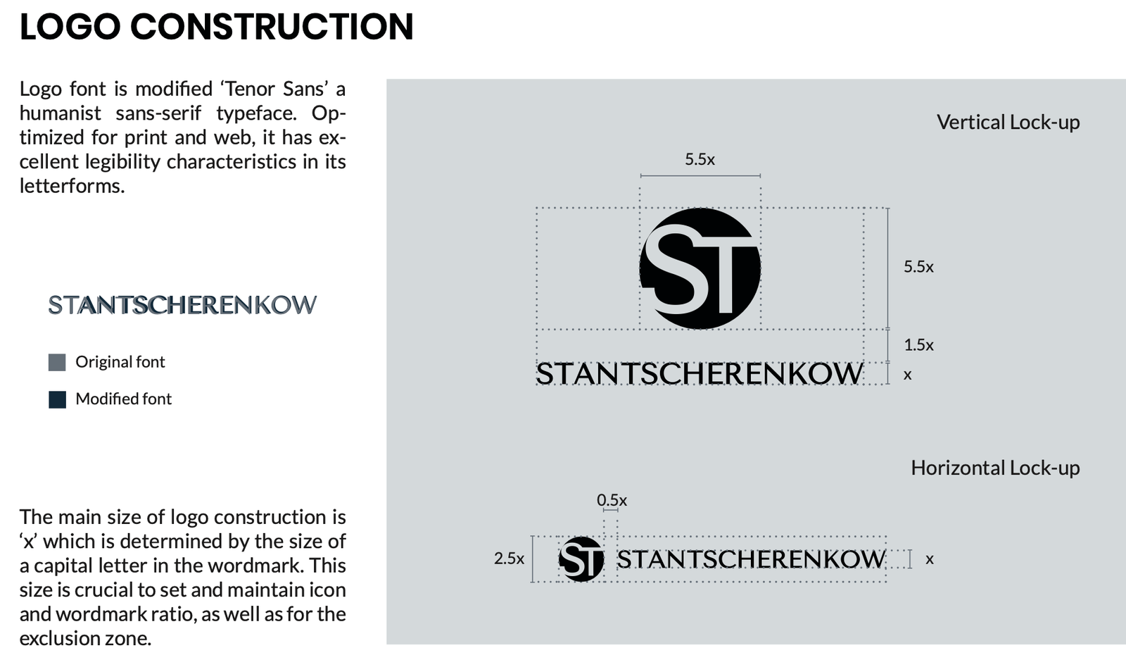 Logo Design: Size, Placement, and Consistency
The logo is often the first visual element that people associate with a brand. Its design, size, placement, and consistency are crucial in creating a strong and lasting impression. A well-designed logo that is consistently and appropriately used becomes a symbol of trust and quality for a brand. Here are key considerations for optimizing the impact of your logo through size, placement, and consistency:
- Size Matters: The size of your logo should be appropriate for its context. On a website, it should be large enough to be recognizable but not so large that it overwhelms other content. On business cards, it needs to be clear and legible, even when small. Consistency in size across different platforms helps maintain a professional image.
- Strategic Placement: The placement of your logo should be consistent across all materials. Typically, logos are placed at the top left corner of web pages and printed materials because people often read from left to right. However, the placement can vary depending on cultural contexts and design layouts. Wherever it appears, the logo should be positioned in a way that is immediately visible to your audience.
- Consistency is Key: Use your logo consistently in terms of color, form, and style. This means avoiding alterations or distortions in different applications. For instance, if your logo is usually displayed in color, avoid using a black-and-white version unless it’s a stylistic choice that aligns with specific branding materials.
- Adaptation for Different Media: While consistency is important, your logo should also be flexible enough to adapt to various media. For instance, you might need a simplified version of your logo for social media icons or an alternative layout for vertical banners. Even in these adaptations, ensure that the core elements of your logo are always recognizable.
- Clear Space and Backgrounds: Always maintain clear space around your logo. This is the buffer zone around the logo that is free from text, graphics, or other elements that could clutter and reduce its impact. Also, be mindful of the background on which your logo is placed; it should always be visible and not lost in background noise.
- Consistent Application Across Materials: Whether it’s digital media, print materials, or physical branding, like signage or product packaging, the application of your logo should be consistent in all contexts. This reinforces brand recognition and conveys a sense of reliability.
- Guidelines for Usage: Create detailed guidelines that specify how your logo should be used, including incorrect uses to avoid. This ensures that anyone using your logo for any purpose, from marketing to partnership branding, maintains its integrity.
By paying attention to these aspects of logo design, size, placement, and consistency, you ensure that your logo effectively represents your brand’s identity and values. This consistency not only strengthens brand recognition but also builds trust and credibility with your audience.

The Tale of Two Brands: Why Luxury Brands Thrive
Luxury brands have long stood as exemplars of successful branding strategies. Their ability to create an aura of exclusivity, excellence, and timeless appeal offers valuable lessons for any business looking to elevate its brand. Understanding why these brands thrive can provide crucial insights for businesses aiming to refine their branding strategies.
- Emphasis on Exclusivity and Quality: Luxury brands often thrive by creating a perception of exclusivity and unmatched quality. They focus on crafting products or experiences that are not just commodities but symbols of a particular lifestyle or set of values. This strategy of exclusivity makes their products highly desirable and justifies premium pricing.
- Consistent Brand Storytelling: Successful luxury brands excel in consistent and compelling brand storytelling. They weave a narrative that resonates with their target audience, often focusing on heritage, craftsmanship, and a unique brand journey. This storytelling extends beyond products to every aspect of the brand experience.
- Focus on Aesthetics and Experience: Luxury brands pay meticulous attention to aesthetics and customer experience. From product design to packaging, and from store layout to customer service, every element is carefully curated to reflect the brand’s high standards and distinct identity.
- Strategic Use of Marketing Channels: These brands often leverage a mix of traditional and digital marketing channels to maintain their brand image. They use high-quality visuals, influencer partnerships, and experiential events to engage their audience while keeping the brand’s exclusivity intact.
- Adaptation to Current Trends and Technologies: While they maintain their core values, successful luxury brands are not averse to adapting to current trends and technologies. This adaptability helps them stay relevant and appealing to newer generations without losing their traditional customer base.
Lessons for Sacramento Businesses:
- Creating a Unique Brand Identity: Like luxury brands, businesses should strive to establish a unique brand identity that differentiates them from competitors.
- Quality and Consistency: Focus on delivering consistent quality in products or services, reinforcing the brand’s reputation.
- Effective Storytelling: Develop a compelling brand story that connects with your audience on an emotional level.
- Customer Experience: Prioritize customer experience in every interaction, ensuring it aligns with the brand’s values and image.
- Adapt and Innovate: Stay abreast of market trends and technological advancements to keep the brand fresh and relevant.
By analyzing the strategies of luxury brands, businesses can gain valuable insights into building a strong, enduring brand. It’s about striking a balance between maintaining core values and adapting to the evolving market landscape. This approach is key to creating a brand that not only survives but thrives in the competitive business world.
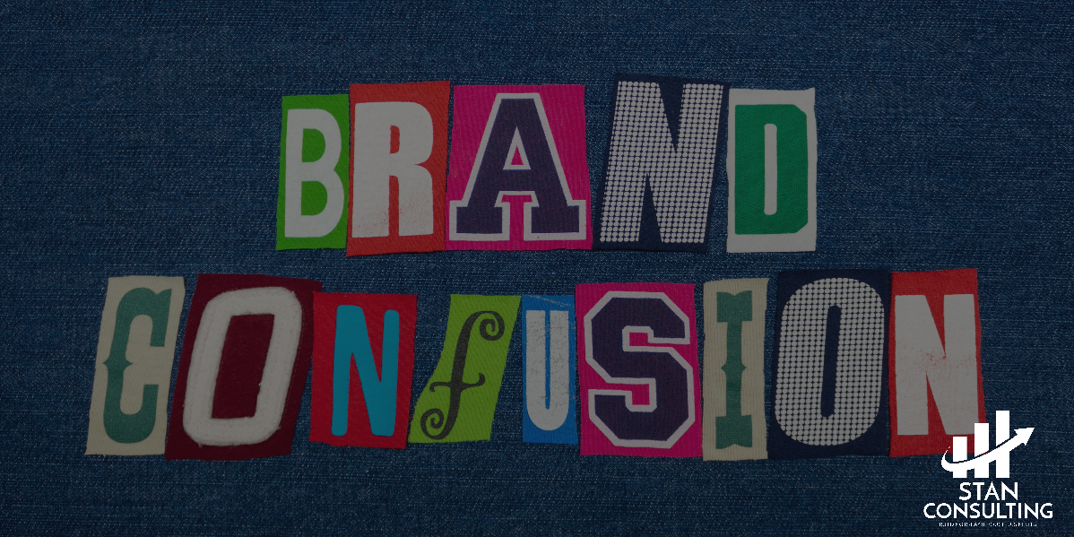
Common Branding Pitfalls: Mistakes That Can Hurt Your Business
Brand management is a delicate balancing act, and even small missteps can have significant repercussions. Awareness of common branding pitfalls can help businesses avoid the traps that have ensnared others. Below are key branding errors to watch out for, accompanied by real-life examples where applicable.
- Lack of Consistency: Inconsistency in branding, such as frequent changes in logo design, color scheme, or messaging, can confuse customers and dilute brand identity. A consistent brand image across all platforms is crucial for recognition and trust.
- Ignoring Brand Positioning: Failing to clearly define and communicate your brand’s position in the market can lead to a lack of differentiation from competitors. A unique value proposition is essential to stand out in a crowded marketplace.
- Neglecting Customer Experience: Overlooking the customer experience at any brand touchpoint can damage your reputation. Every interaction, whether online or offline, should reflect the brand’s values and promise.
- Inappropriate Brand Voice: Using a brand voice that doesn’t resonate with your target audience or is inconsistent across different mediums can alienate potential customers. The tone and style of communication should be tailored and consistent.
- Overcomplicating the Brand: Making the brand too complex, either through convoluted messaging or overly intricate design, can hinder customer understanding and engagement. Simplicity often leads to stronger brand recall.
- Underestimating Visual Identity: Visual elements like logos, typography, and colors are not just aesthetic choices; they communicate much about a brand. Poorly designed or outdated visual elements can give an impression of unprofessionalism.
- Failing to Adapt: While consistency is key, rigidly sticking to old branding strategies in a changing market can lead to obsolescence. Brands need to evolve while maintaining their core identity.
Real-Life Examples:
- Pepsi’s Insensitive Ad: In 2017, Pepsi released an ad featuring Kendall Jenner that was intended to promote global unity, peace, and understanding. However, it backfired dramatically, receiving widespread criticism for being insensitive and tone-deaf. The ad was seen as trivializing the Black Lives Matter movement and treating serious protests as mere entertainment.
- Gap’s Logo Redesign Failure: In 2010, Gap attempted to modernize its brand by redesigning its 20-year-old logo. The new logo, featuring a black, bold font with a blue square, was immediately rejected by consumers. This led to the creation of satirical responses online, such as a “Crap Logo Yourself” site. Gap’s attempt to transition from a “classic, American design to modern, sexy, cool” ended up alienating its loyal customer base.
- Burger King’s Controversial Women’s Day Tweet: On International Women’s Day in 2021, Burger King’s UK division tweeted, “Women belong in the kitchen,” followed by tweets explaining a scholarship program for women in culinary arts. Despite the progressive intent, the initial tweet was perceived as sexist, resulting in significant backlash. Many users didn’t get past the first tweet, seeing it as a tone-deaf attempt to honor Women’s Day.
These examples highlight the importance of thoughtful branding decisions. Mistakes in branding can be costly, but they also provide valuable lessons on the importance of consistency, clear positioning, and adapting to changing market dynamics. By learning from these pitfalls, businesses can develop stronger, more resilient brands.

The SMART 5-Step Formula to a Winning Brand Strategy
To build a memorable and effective brand strategy, particularly in competitive markets, the “SMART” formula encapsulates key principles. Each letter in “SMART” stands for a strategic step:
- Strategize Your Unique Position
- Manifest a Strong Brand Identity
- Articulate Through Comprehensive Guidelines
- Reinforce Across All Touchpoints
- Track and Evolve
- Strategize Your Unique Position: Identify what makes your brand unique. Research your market and audience to define a value proposition that truly stands out.
- Manifest a Strong Brand Identity: Develop a distinct visual and verbal identity. This includes your logo, color palette, and brand voice. Ensure these elements are simple yet memorable.
- Articulate Through Comprehensive Guidelines: Create clear, concise guidelines for your brand’s representation. This ensures consistency and ease of understanding across all platforms.
- Reinforce Across All Touchpoints: Consistently apply your brand identity in every interaction with customers. This reinforces brand recognition and loyalty.
- Track and Evolve: Regularly evaluate your brand’s performance. Stay responsive to market trends and customer feedback, adapting while maintaining your essence.
The “SMART” approach not only guides the development of a robust brand strategy but also emphasizes the importance of simplicity and memorability in all aspects of branding.

Conclusion: Solidifying Your Brand’s Future
In conclusion, the power of consistent branding cannot be overstated. It’s the cornerstone of how your business communicates its values, connects with its audience, and distinguishes itself in a crowded marketplace. A strong, consistent brand builds trust, fosters loyalty, and paves the way for long-term success.
As you move forward, remember that branding is not a one-time effort but an ongoing process of adaptation and refinement. Regularly evaluate your brand’s impact, stay attuned to market changes, and be ready to evolve while maintaining your core identity. By doing so, you solidify your brand’s future and ensure that it continues to resonate and thrive in an ever-changing business landscape.
Let's Be friends
Subscribe to be the first to hear about our exclusive offers and latest marketing tips.